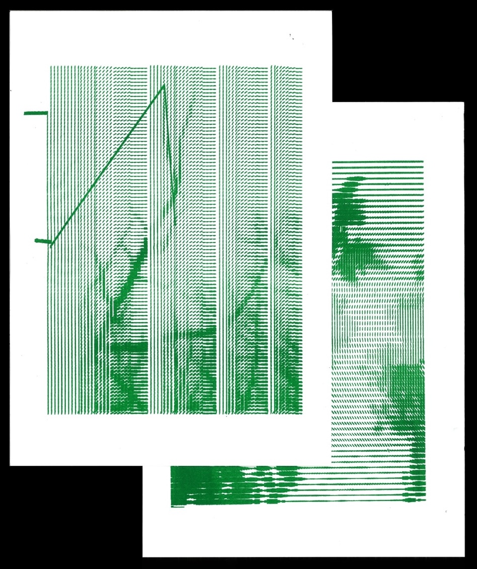
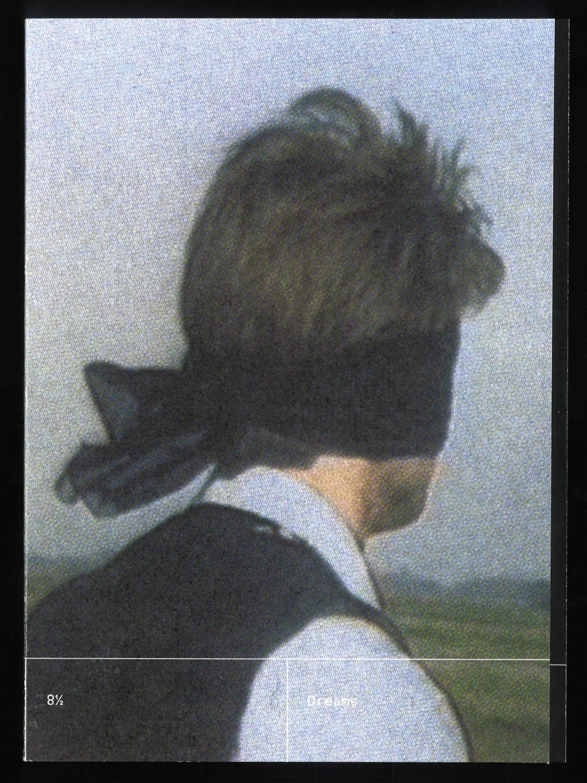
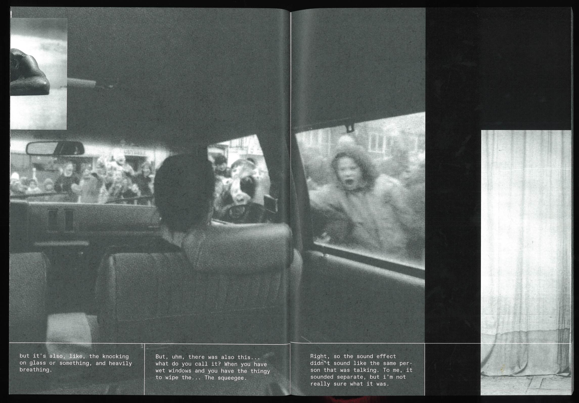
and prolific experimenter / typography enthusiast / recent graduate from Graphic Design (BA) at ArtEZ Arnhem. I like designing books and other printed matter, teaching robots to draw, and many other things. I am currently open for business.
RECENTLY
CONTACT
Instagram, E-mailand prolific experimenter / typography enthusiast / recent graduate from Graphic Design (BA) at ArtEZ Arnhem. I like designing books and other printed matter, teaching robots to draw, and many other things. I am currently open for business.
RECENTLY
CONTACT
Instagram, E-mail
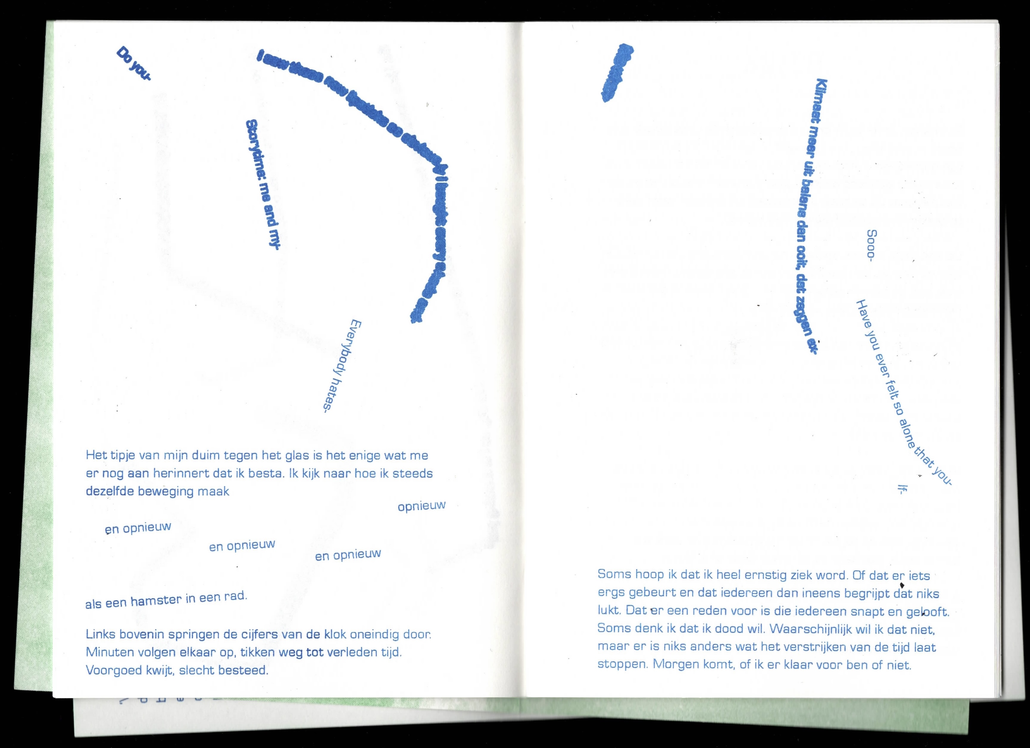
A book design for writer Mees Elia de Wijn. Vogelvrij
covers themes of mental exhaustion, alienation and the continuous confrontation with time within a society
that always stays moving. The book uses experimental typography and narrative techniques, and has an
asymmetrical shape that signifies a bird, an important character in the story.
Book, RISO printed,
2026
530 Type Club is a font-collective that hosts workshops and studies on experimental typography. Set Rules, Unexpected Outcomes: On Workshop-Based Design Practices is an investigation on how workshop-based creative practices engage with community, thinking through making, and archiving: the core of 530 Type Club.
This is a book about internet censorship, based on publicly
available data.
Every page contains a case of a
country blocking one or more websites, or shutting down the whole internet, for a particular period of
time. The information is formatted
like a punch card, where the numbers form a unique pattern based on the dates and duration of a case. The
colour of the cards is darker in cases where the internet was blocked for longer. The book becomes a
physical
stack
of data, available both online and offline.
Book,
Digital + RISO printed, 2023
In the autumn of 2023 I asked some folks to watch a
film scene - the opening scene from 8½ (1963) - while I recorded their
reaction. The scene is three minutes long, and shows a highly symbolic dream sequence.
I tried out a couple of experimental ways of showing them the scene, in order to find some new
meaning or interpretation of it, eventually having them view it with their eyes closed.
This book consists of the recorded interpretations of the scene, combined with images I found myself, to
create a sense of what the viewers may have imagined, and to peek into the
associative nature of the mind.
Book, digitally printed,
2023
A display typeface intended to dazzle the viewer with its
intricate and almost psychedelic linework. It is based on multiple typographic experiments, out of which
came a loose set of rules to create this typeface. To make it, I first created a skeleton
font
digitally, drew the spikes
by hand, and digitalised the result. It was created at my course's
Typography class, and is
featured in Character Club, a
collective publication with typefaces made by students of this class.
Typeface, 2022
Website by Jonas Riemersma, 2026
& uses Bianzhidai by Xiaoyuan Gao (Velvetyne)